
01 — The Rebuild
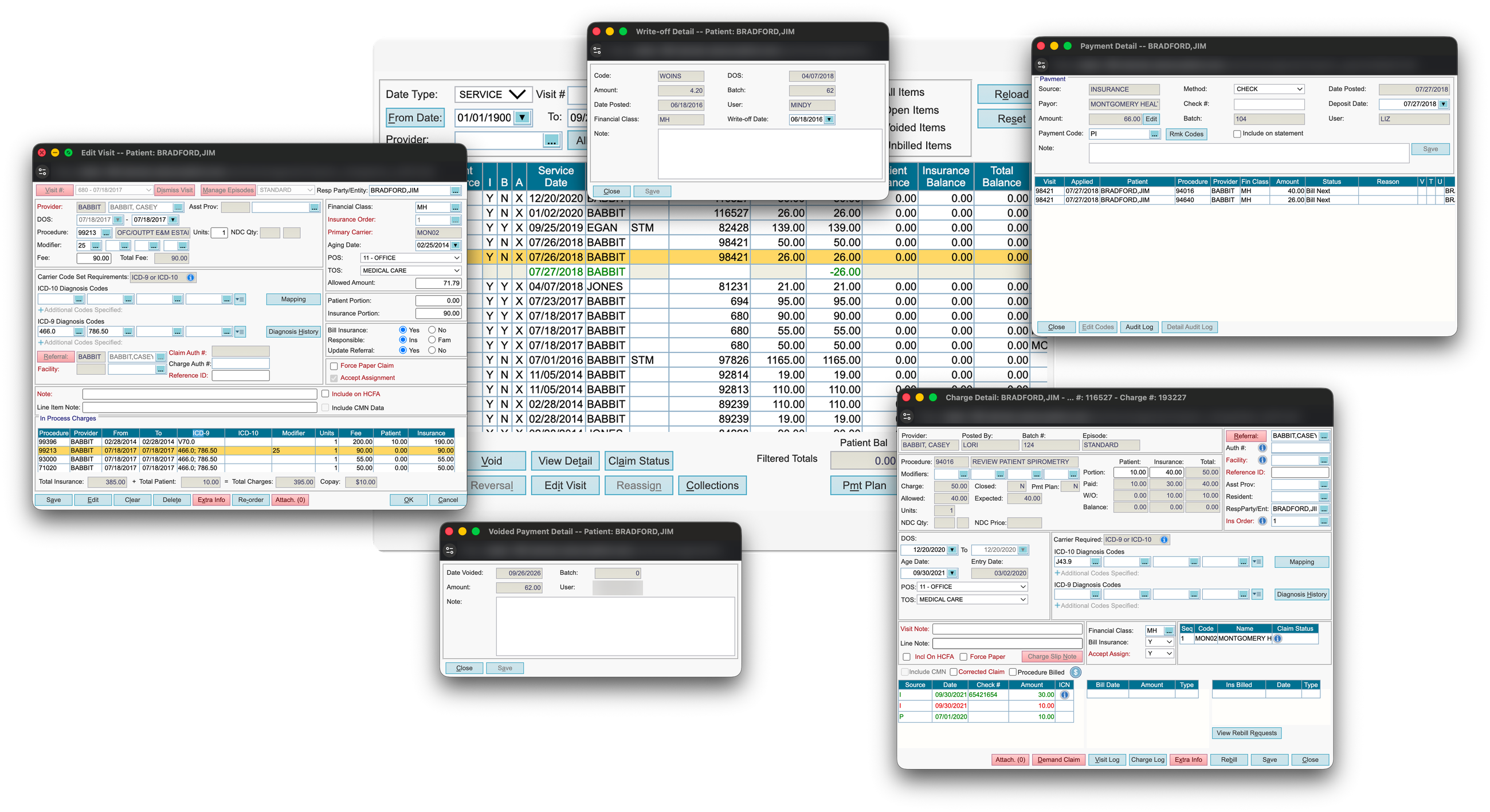
AdvancedMD needed to rebuild Patient Transaction History as part of a required technology upgrade. The existing screen was heavily used by billing staff, but it was built on older technology and relied on multiple windows to display financial information.
We could have recreated the existing experience in the new framework. Instead, I wanted to understand how people were actually using it and where we could make the work easier.
The project also gave us an opportunity to build on the card framework we’d established for Patient Demographics.
02 — The Existing Workflow
Understanding the existing workflow
Patient Transaction History is where billing staff review charges, payments, adjustments, and other financial activity associated with a patient.
The legacy screen displayed a lot of information, but reviewing that information and acting on it often required moving between separate windows.
Users could see a transaction in one place, open another window for details, and navigate elsewhere to complete an action.
That wasn’t necessarily how they thought about the work.
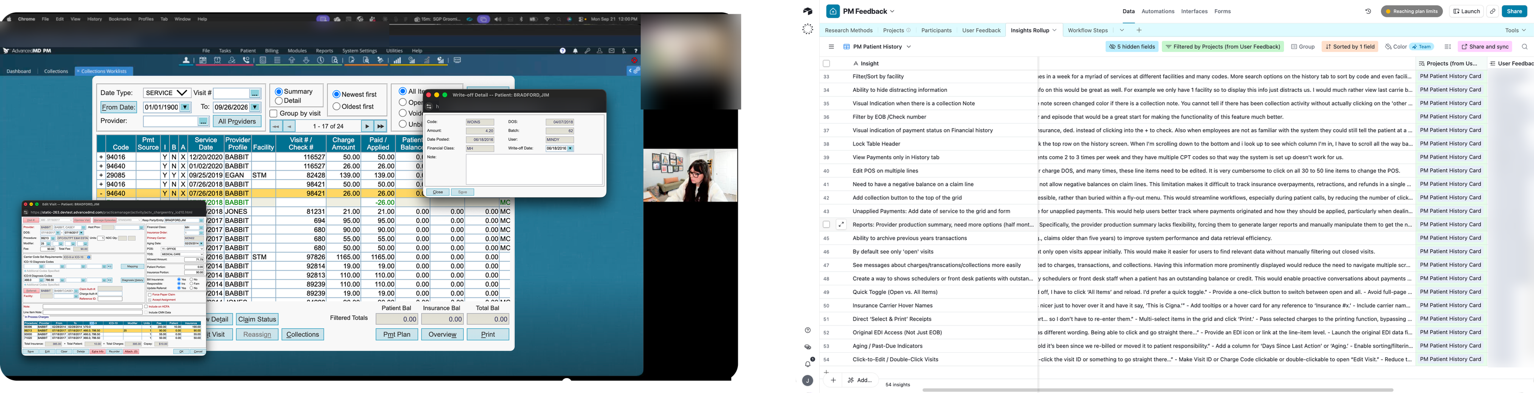
I conducted five client research sessions and three internal expert sessions, then compared what I learned with existing customer feedback.
One comment captured an important distinction:
“I don’t work charges, I work visits.”
Billing staff weren’t simply reviewing individual transactions. They were trying to understand the financial activity associated with a visit and determine what needed attention.
03 — Organizing by Visit
Organizing the history around visits
One of the biggest decisions was how to organize the financial information.
The legacy experience emphasized individual transactions. But users frequently needed to understand the relationship between charges, payments, adjustments, and the visit they belonged to.
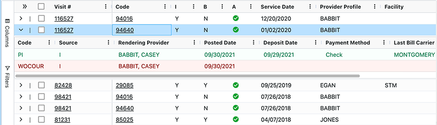
The redesigned card introduces a visit-level hierarchy. Users can review a visit and expand it to see the underlying financial activity without losing the broader account history.
This gives billing staff a way to work at the level that makes sense for the task while still accessing individual transaction details.
04 — Configurable Columns
Letting people configure their workspace
Different billing roles need different information.
A user reviewing charges may care about different columns than someone investigating payments or working through account balances. The legacy layout offered limited flexibility, leaving people to work around a fixed set of columns.
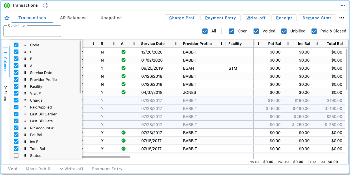
The new card uses a configurable grid.
Users can reorder, hide, show, and pin columns, then save their configuration as a Preferred View.
Rather than trying to create one perfect layout for every billing workflow, we gave users more control over the information they need to see.
05 — Details in Context
Keeping details and actions in context
The other important change was reducing how often users had to leave the history to investigate something.
In the legacy experience, opening details could mean navigating through separate pop-ups and then returning to the original screen.
In the redesign, details and available actions open in a flyout alongside the transaction history.
That means users can investigate a charge or review related information while keeping the surrounding financial activity visible.
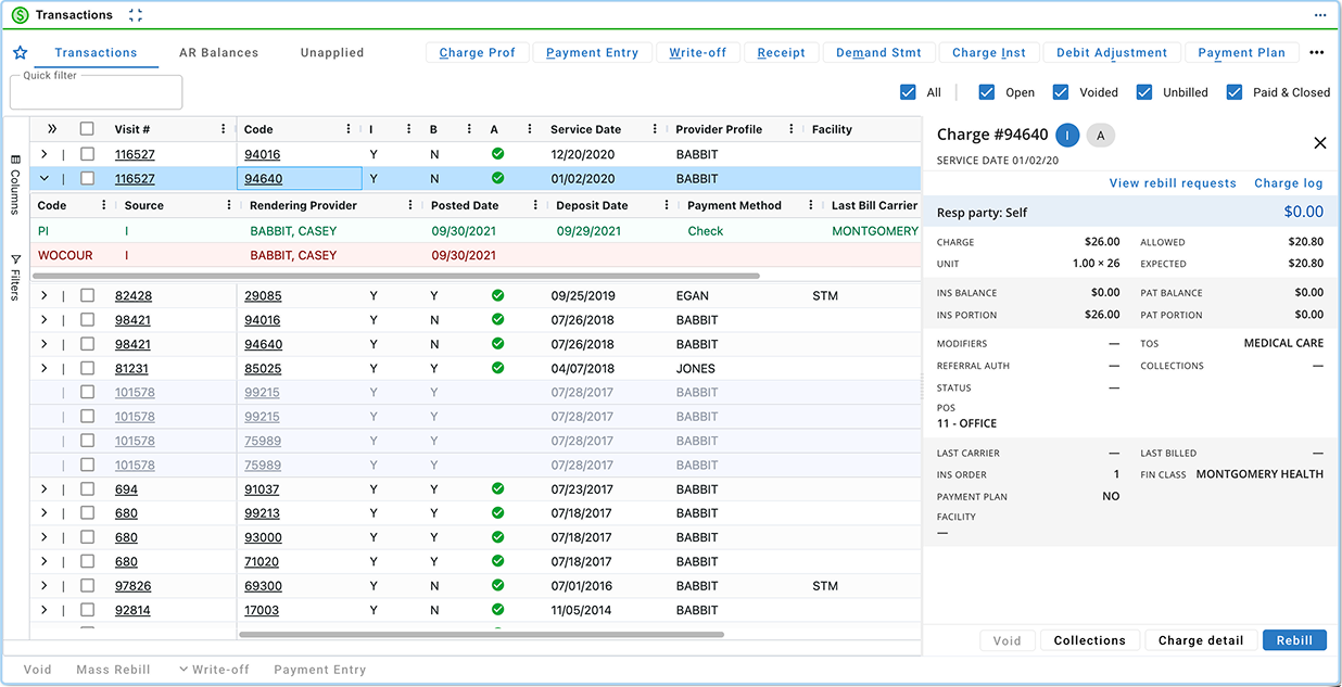
This doesn’t mean every financial workflow is contained in the new card. Some actions still depend on other parts of the platform.
But it gives us a better foundation for bringing related work together as those workflows are modernized.
06 — Measuring the Redesign
Planning how to measure the redesign
The new experience was designed to address problems we’d heard in research, but that doesn’t tell us whether it will actually improve the workflow.
Before beta, I worked with Product to identify the signals we’d need to evaluate.
We wanted to understand whether people could complete their work with fewer trips back to the legacy experience, whether they used the new in-context details, and whether they found enough value in the configurable grid to save Preferred Views.
For payment-related workflows, we also wanted to understand whether the changes helped people complete their work more efficiently.
Pendo data gave us a baseline for understanding existing usage, including which roles used the screen and how they interacted with it.
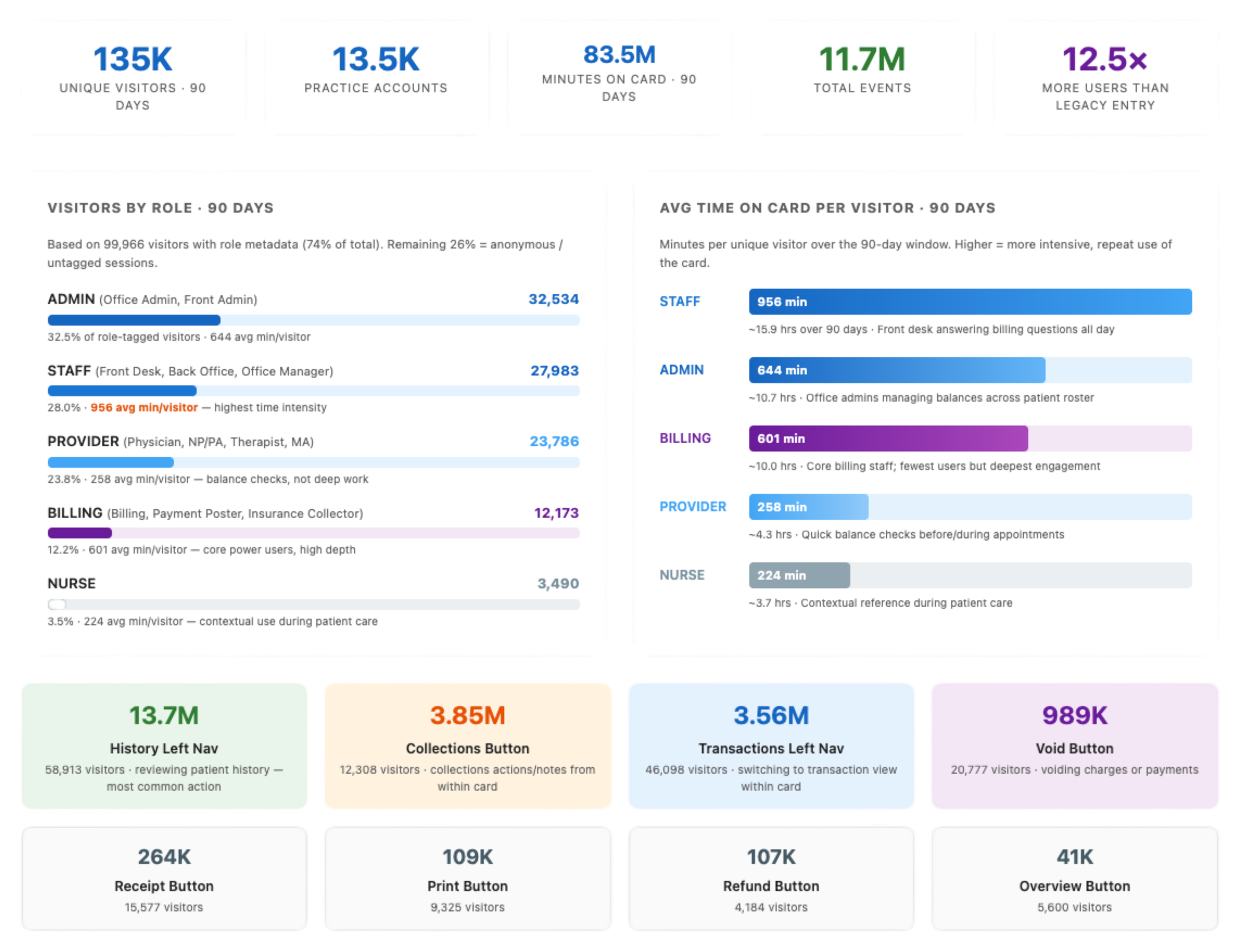
The plan is to combine behavioral data with direct customer feedback rather than relying on usage metrics alone.
07 — Where Things Stand
Where things stand
The redesigned Patient Transaction History is moving through the beta process.
The work brings visit-level financial history, configurable views, and more transaction details into a single experience built on the newer card framework.
There are still workflows to improve, and beta research will help us understand which decisions are working and where users continue to encounter friction.
The original requirement was to replace outdated technology. Research gave us a reason to do more than reproduce the old interface.
Now we have a redesign that reflects how billing staff described their work, along with a plan to find out whether it actually makes that work easier.