
01 — Taking Over the Redesign
When I took over the Patient Demographics redesign, the direction had already been approved and the project was moving toward development and release.
The existing screen was a dense, traditional form. The redesign introduced a modular card framework with collapsible sections, intended to make patient information easier to organize and establish a reusable pattern for the rest of the patient chart.
Early beta feedback was encouraging. But after the redesign reached general availability, we started hearing from users who were struggling with it.
The problem wasn’t necessarily the card framework. It was that we hadn’t adequately tested how the new experience worked for the people who spent the most time in it.
02 — What We Missed in Beta
What we missed in beta
The original beta cohort leaned toward smaller practices and intake-focused workflows.
Billing and coding staff used Patient Demographics differently. They worked in the screen for long stretches, needed to scan information quickly, and relied on familiar layouts and keyboard interactions to move through their work.
The new design had improved the organization of information, but it also introduced more whitespace, additional interactions, and changes to conventions those users depended on.
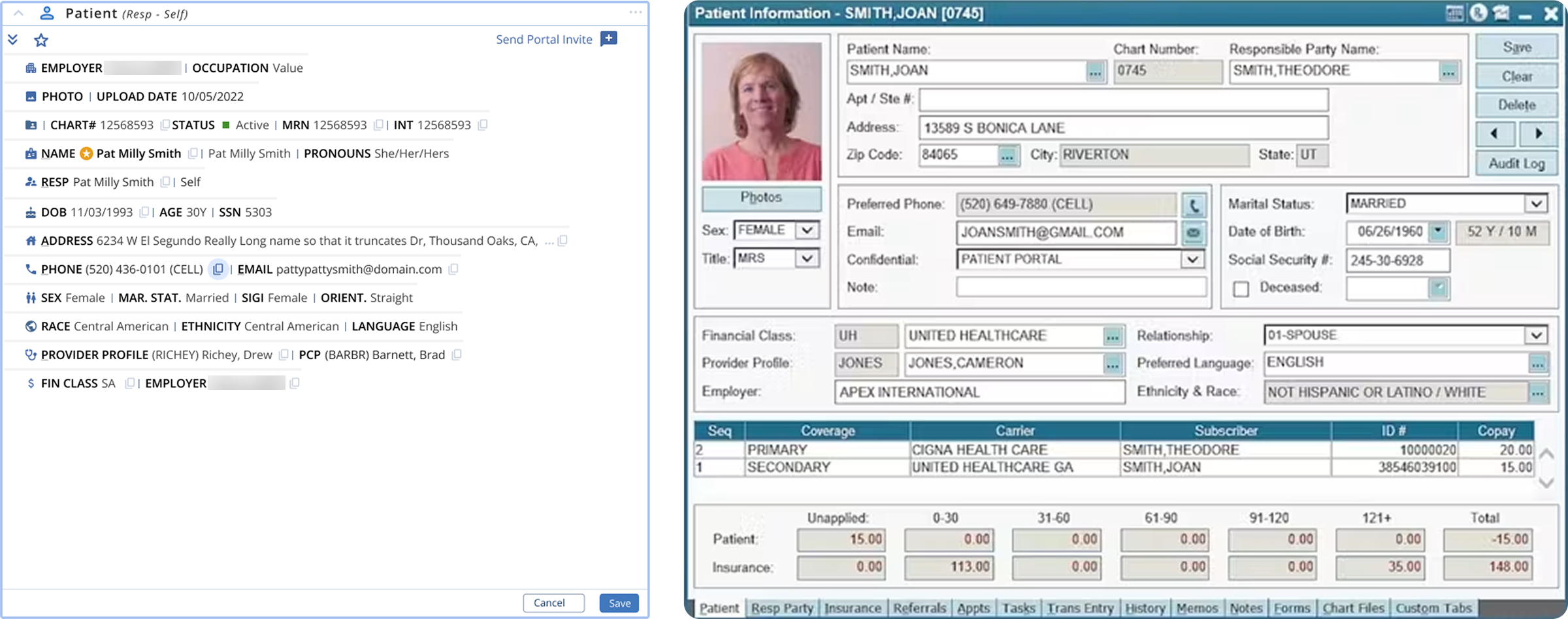
Once the redesign reached a broader audience, the complaints made those gaps difficult to ignore.
Rather than revert to the old screen or make changes based on individual requests, I went back to research.
03 — Going Back to the Users
Going back to the users
I conducted nine structured sessions with billing, coding, and operations users.
We worked through their actual tasks, looked at where the new layout slowed them down, and tried possible changes during the sessions.
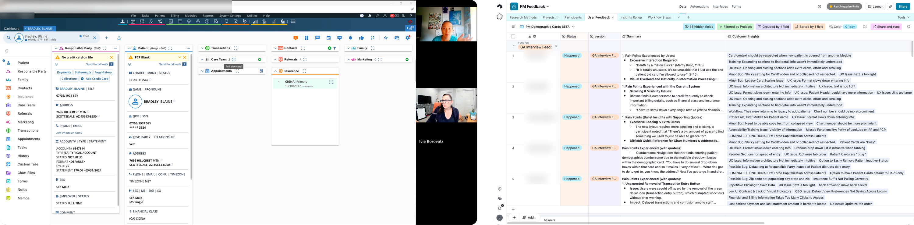
One session changed the direction of the redesign.
I was manipulating the card layout with a user to understand what made the information difficult to scan. When we tried a simpler single-column arrangement, she found the content much easier to read.
That gave me a useful direction to explore.
I discussed the layout with our lead developer and confirmed that we could make changes without rebuilding the underlying card framework.
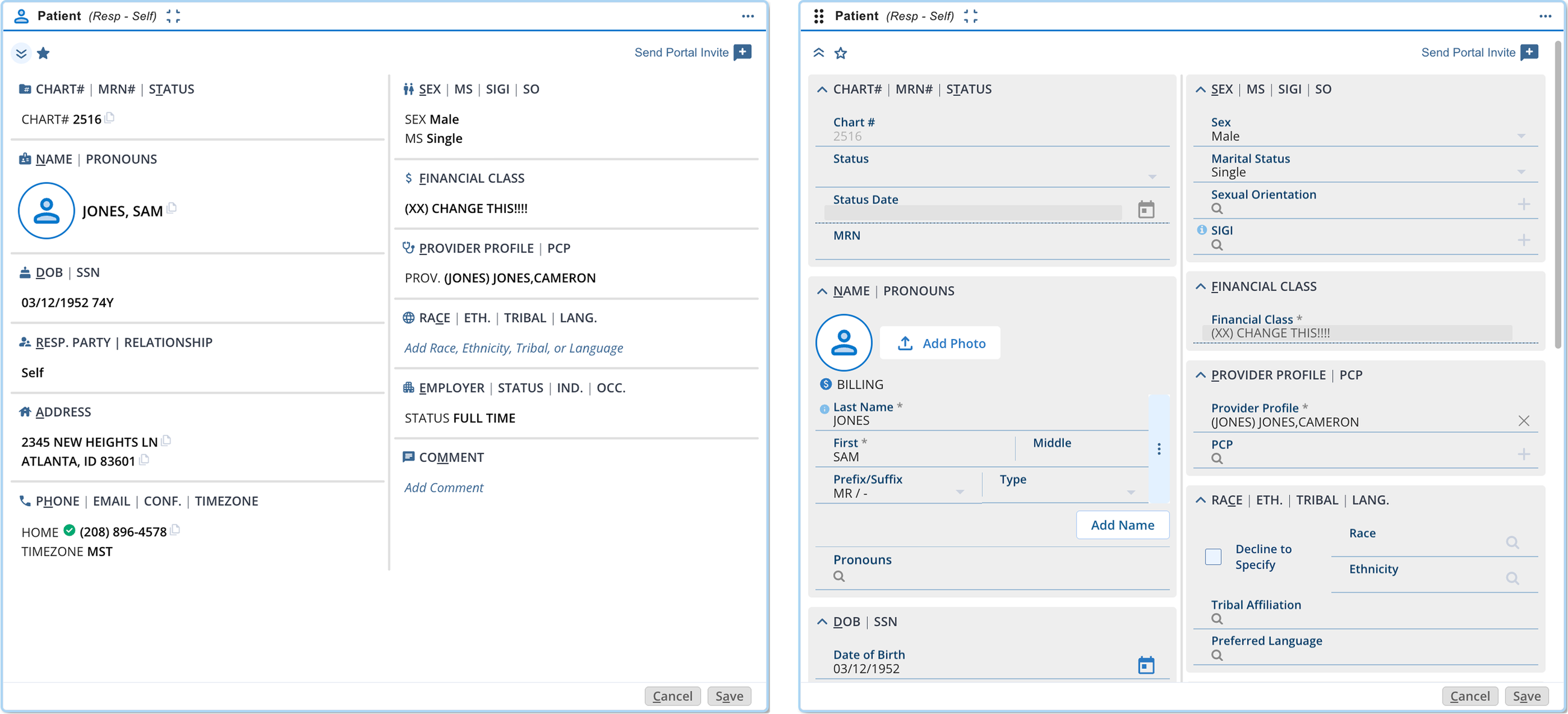
The resulting design used two columns, with clearer labels and a more deliberate information hierarchy. It preserved the organization of the new cards while bringing back some of the density experienced users needed.
04 — Fixing the Interactions
Fixing the interactions around the layout
The layout was the most visible complaint, but it wasn’t the only thing slowing people down.
I designed a broader set of changes based on the research and customer feedback.
We restored familiar patient-name conventions, made card settings persist between visits, added the chart number to patient search, and brought upcoming appointment information into the patient context.
We also replaced many of the secondary pop-up interactions with type-ahead fields so users could keep entering information without repeatedly opening another window.
The important part was treating each section as a workflow rather than simply applying the same form pattern everywhere.
We kept the underlying card architecture, but changed how people interacted with it.
05 — The Name Format
A smaller issue with bigger consequences
One problem wasn’t about the layout at all.
The redesign had introduced title-case names displayed in First Last order. It looked cleaner, but the underlying patient database contained years of names entered in uppercase.
Converting those records to title case wasn’t reliable. Names such as McArthur and MacDonald could be displayed incorrectly, and users were seeing inconsistent name formatting across the product.
The change also disrupted a familiar convention used throughout the legacy system.
As customer feedback accumulated, I identified the pattern and worked with our product owner to bring the evidence to leadership.
We recommended restoring the original Last, First convention and supporting the existing uppercase data.
Leadership agreed, and the change shipped in September 2025.
It was a useful reminder that a visual improvement can create a usability problem when it doesn’t account for the data and conventions people already rely on.
06 — After the Changes
What happened after the changes
We tracked customer feedback, support cases, usage behavior, and how often users switched back to the legacy screen.
The results were encouraging.
Comparing the same month year over year:
- 61% fewer dead clicks per user
- 18% fewer clicks overall per user
- About three fewer minutes per user per day on patient information
- About half as many clicks to find a patient
That time difference works out to an estimated 12 or more hours per user annually.
Layout and usability complaints, which had dominated the feedback at launch, fell to nearly zero. No new ideas about the card had been submitted since March 2026.
Support cases increased during two periods when customers were transitioning away from the legacy experience, then settled below their pre-transition level.
We also watched the number of users choosing to return to the classic screen.
At the name-format fix, usage was at 89% of its peak. It fell to 53% around the two-column release and 13% by the legacy sunset, eventually reaching zero.
The decline reflects the changes made across the experience as well as the retirement of the legacy screen. It wouldn’t be accurate to attribute the entire change to any one design decision.
But taken together with the research, customer feedback, and usage data, the results show a meaningful improvement from the original launch.
07 — What I’d Take Forward
What I’d take forward
The original redesign wasn’t a wasted effort. It established a card framework that the product could continue using, including for Patient Transaction History.
What we missed was the opportunity to test it with the people whose workflows placed the greatest demands on the interface.
Once we included those users, the problems became clearer. And because we understood the underlying architecture, we could make targeted changes instead of starting over.
This project reinforced something I think about whenever we’re redesigning an established product: improving the interface isn’t just about making it cleaner. It’s about understanding which parts of the existing experience people depend on, even when those parts aren’t particularly attractive.
The best outcome wasn’t simply that we kept the new design. It was that we made it work better for the people using it every day.